
Food Waste - Exploring “Food Loss and Waste” Database from FAO
In this post, we’ll take a quick look at the Food Loss and Waste Database (FLW DB) from the Food and Agriculture Organization (FAO) of the United Nations. The post will be mostly about data visualization and the limitations of the dataset.
I used Python and Pandas/Seaborn/Matplotlib libraries to visualize the data. You can find the full Python scripts on my GitHub repository.
TL;DR
As described in the Background of the Food Loss and Waste Database page, the dataset has clear limitations. The data collection research for food waste and loss seems to be at a very early stage, so it’s hard to draw a meaningful and insightful conclusion just by looking at the dataset. However, since data visualization is fun, I plotted some satisfying graphs.
Database Overview
Downloading the Data
Please follow the below steps to download the dataset. (Note: The following steps are valid as of March 2022)
- Go to FAO’s FLW data page. link.
- Select “Year Range.” I used 1965 - 2021 for this post.
- Download data by clicking the “Download Data” button on the bottom left of the page.
Here are the first few rows of the dataset.
# read and show the first few rows of the dataframe
df = pd.read_csv('./data/Data.csv')
df[:8]
| m49_code | country | region | cpc_code | commodity | year | loss_percentage | loss_percentage_original | loss_quantity | activity | food_supply_stage | treatment | cause_of_loss | sample_size | method_data_collection | reference | url | notes | |
|---|---|---|---|---|---|---|---|---|---|---|---|---|---|---|---|---|---|---|
| 0 | 104 | Myanmar | NaN | 0142 | Groundnuts, excluding shelled | 2009 | 5.22 | 5.22% | 68100 | NaN | Whole supply chain | NaN | NaN | NaN | FAO's annual Agriculture Production Questionna... | FAO Sources | NaN | NaN |
| 1 | 104 | Myanmar | NaN | 0142 | Groundnuts, excluding shelled | 2008 | 5.43 | 5.43% | 65240 | NaN | Whole supply chain | NaN | NaN | NaN | FAO's annual Agriculture Production Questionna... | FAO Sources | NaN | NaN |
| 2 | 104 | Myanmar | NaN | 0142 | Groundnuts, excluding shelled | 2007 | 5.61 | 5.61% | 61080 | NaN | Whole supply chain | NaN | NaN | NaN | FAO's annual Agriculture Production Questionna... | FAO Sources | NaN | NaN |
| 3 | 104 | Myanmar | NaN | 0142 | Groundnuts, excluding shelled | 2006 | 5.40 | 5.4% | 55270 | NaN | Whole supply chain | NaN | NaN | NaN | FAO's annual Agriculture Production Questionna... | FAO Sources | NaN | NaN |
| 4 | 104 | Myanmar | NaN | 0142 | Groundnuts, excluding shelled | 2005 | 5.00 | 5% | 51970 | NaN | Whole supply chain | NaN | NaN | NaN | FAO's annual Agriculture Production Questionna... | FAO Sources | NaN | NaN |
| 5 | 104 | Myanmar | NaN | 0142 | Groundnuts, excluding shelled | 2004 | 5.00 | 5% | 47310 | NaN | Whole supply chain | NaN | NaN | NaN | FAO's annual Agriculture Production Questionna... | FAO Sources | NaN | NaN |
| 6 | 104 | Myanmar | NaN | 0142 | Groundnuts, excluding shelled | 2003 | 5.00 | 5% | 43880 | NaN | Whole supply chain | NaN | NaN | NaN | FAO's annual Agriculture Production Questionna... | FAO Sources | NaN | NaN |
| 7 | 108 | Burundi | NaN | 0111 | Wheat | 2020 | 3.50 | 3.5 | NaN | Shelling, Threshing | Farm | NaN | NaN | NaN | Modelled Estimates | NaN | https://www.aphlis.net/en/page/20/data-tables#... | NaN |
Columns
Here are the columns that I’ll be primarily using for this post. I believe the column names are self-explanatory, but please look at the Background of the Food Loss and Waste Database page for the full details.
- year
- e.g. 2017, 2018, …
- country
- There are 149 unique countries.
- e.g. ‘Austria’, ‘Jordan’, ‘Kenya’, …
- commodity
- There are 194 unique commodities.
- e.g. ‘Apples’, ‘Pears’, ‘Apricots’, ‘Cherries’, ‘Peaches and nectarines’, ‘Plums and sloes’, ‘Kiwi fruit’, ‘Strawberries’, ‘Blueberries’, …
- food_supply_stage
- There are 20 unique food supply stages.
- e.g. ‘Whole supply chain’, ‘Farm’, ‘Harvest’, ‘Storage’, ‘Processing’, ‘Trader’, ‘Retail’, …
- loss_percentage
- e.g. 5%, 13.5%, 43.2%…
Data Visualization
I apologize for the small font size of the plots. I’m too lazy to rewrite the code. Please open the images in new windows to see the plots better.
Which Commodity Has The Most Food Waste?
This section visualizes loss percentages for each commodity.
The U.S. (Whole Supply Chain)
Let’s first look at the U.S. data. I’ll be looking at the “Whole supply chain” data from 2005.
country = 'United States of America'
year = 2005
supply_stage = "Whole supply chain"
df_filtered = df[(df['country'] == country) &
                 (df['food_supply_stage'] == supply_stage) &
                 (df['year'] > year)]

plot_order = df_filtered.groupby(by='commodity').mean().sort_values(by='loss_percentage', ascending=False).index.tolist()
fig, ax = plt.subplots(figsize=(20, 6))
plot = sns.barplot(x='commodity', y='loss_percentage', data=df_filtered, order=plot_order, ci='sd')
ax.set_xticklabels(ax.get_xticklabels(), rotation = 45, horizontalalignment='right')
ax.set_title(f"Food Loss ({supply_stage}) by Commodity in {country}, (data from {year}, vertical bars show stddev)".title())
ax.set(xlabel=None)
plt.show()
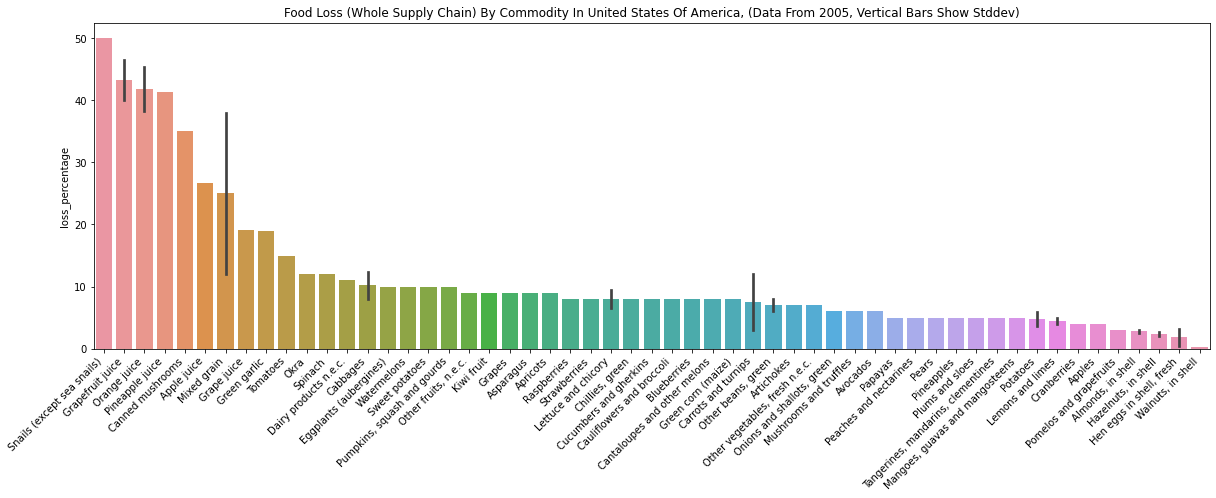
Here are some interesting findings.
- “Grapefruit juice” has a large loss percentage while “Grapefruits” has a small loss percentage.
- “Mixed grain” loss is large while individual grains (“Wheat” and “Barley”) losses are very small.
- There are no data for meat. I don’t see beef, pork, and chicken.
Other Countries (Whole Supply Chain)
Here are some plots for different countries that used the same code as the above. There are more plots in my repo.
Canada
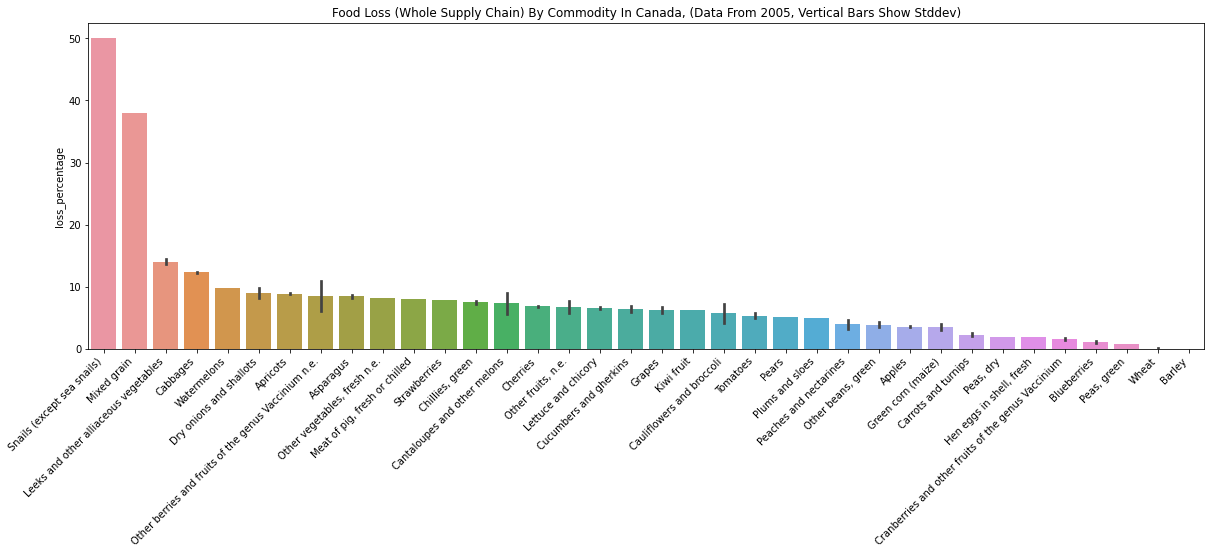
- Canada data is very similar to U.S. data.
- There is “Meat of pig, fresh or chilled” in Candata data, which is not found in the U.S. data.
Austria, Germany, Hungary
The followings data are from three European countries.
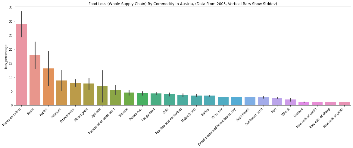
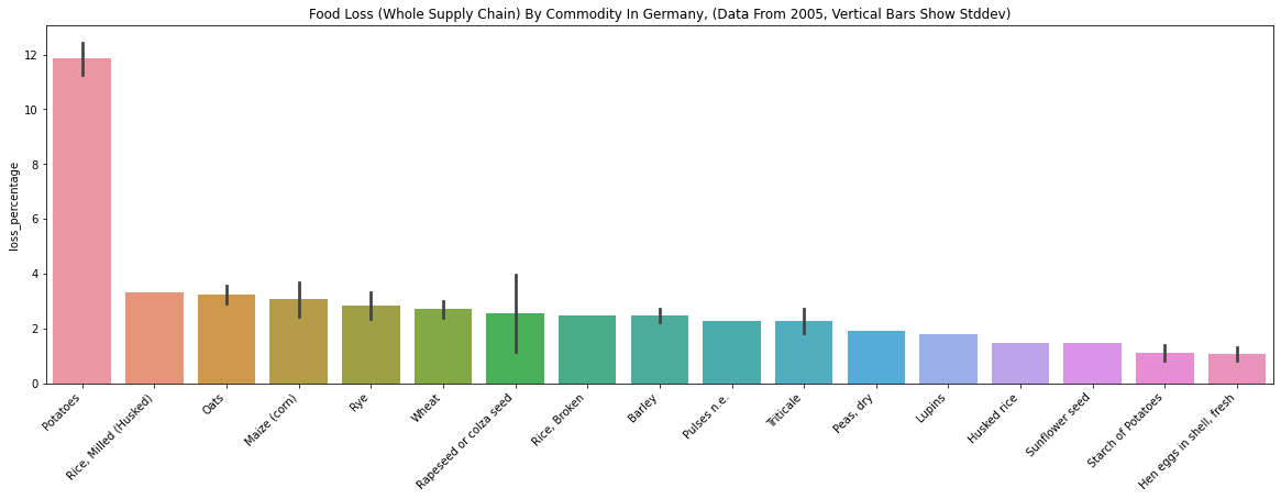
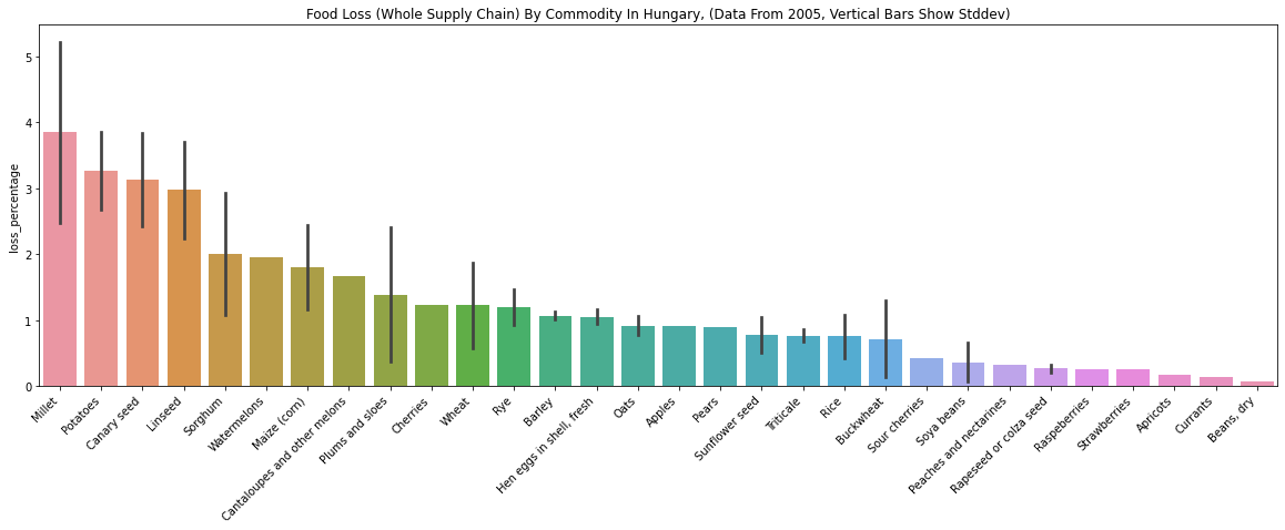
- The above plots are mostly about grains (e.g., Rye, Wheat, Barley). I guess grain data in these countries were easier to collect than other commodities for FAO.
- “Plums and sloes” loss is low in Hungary (about 2.5%), while the same number is high for Austria (about 28%). It’s hard to believe that Austria is ten times more efficient in processing plums than Hungary. I looked at the “reference” and “method_data_collection” of the rows, but they seem to be the same. To me, this seems like a limitation of the dataset - even though the data collection method is the same, it’s hard to believe the numbers.
year = 2005
supply_stage = "Whole supply chain"
countries = ["Hungary", "Austria"]
commodity = "Plums and sloes"
df_filtered = df[df['country'].isin(countries) &
                 (df['food_supply_stage'] == supply_stage) &
                 (df['year'] > year) & (df['commodity'] == commodity)]
df_filtered[['country', 'commodity', 'loss_percentage', 'food_supply_stage', 'method_data_collection','reference', 'year']]
| country | commodity | loss_percentage | food_supply_stage | method_data_collection | reference | year | |
|---|---|---|---|---|---|---|---|
| 7720 | Hungary | Plums and sloes | 2.40 | Whole supply chain | FAO's annual Agriculture Production Questionna... | FAO Sources | 2014 |
| 10267 | Austria | Plums and sloes | 26.12 | Whole supply chain | FAO's annual Agriculture Production Questionna... | FAO Sources | 2007 |
| 10282 | Austria | Plums and sloes | 35.30 | Whole supply chain | FAO's annual Agriculture Production Questionna... | FAO Sources | 2006 |
Mexico, Peru
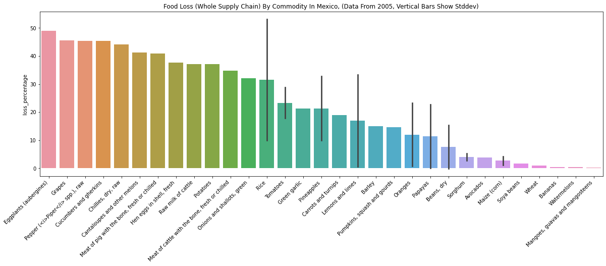
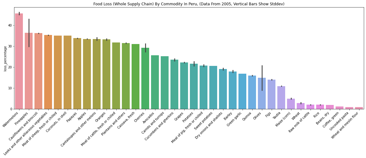
- “Watermelons” loss percentages seem too different for these two countries. Mexico is about 0.4%, and Peru is about 45%.
- The Mexico data doesn’t have a reference, so the large difference makes sense. One can imagine how difficult collecting food waste data is.
year = 2005
supply_stage = "Whole supply chain"
countries = ["Mexico", "Peru"]
commodity = "Watermelons"
df_filtered = df[df['country'].isin(countries) & (df['food_supply_stage'] == supply_stage) & (df['year'] > year) & (df['commodity'] == commodity)]
df_filtered[['country', 'commodity', 'loss_percentage', 'food_supply_stage', 'method_data_collection','reference', 'year']]
| country | commodity | loss_percentage | food_supply_stage | method_data_collection | reference | year | |
|---|---|---|---|---|---|---|---|
| 13919 | Mexico | Watermelons | 0.42 | Whole supply chain | NaN | NaN | 2011 |
| 17149 | Peru | Watermelons | 45.19 | Whole supply chain | FAO's annual Agriculture Production Questionna... | FAO Sources | 2007 |
| 17178 | Peru | Watermelons | 45.17 | Whole supply chain | FAO's annual Agriculture Production Questionna... | FAO Sources | 2006 |
Food Loss Per Commodity (Whole Supply Chain)
As we have seen from the Watermelon data from Mexico and Peru, there might be a massive difference if the data collection methods are different. From now on, I’ll only use the data where the reference is “FAO Sources” and “method_data_collection” is “FAO’s annual Agriculture Production Questionnaires.” The below box plot shows the food loss percentage distribution per commodity from all the countries.
supply_stage = "Whole supply chain"
year = 2005
reference = "FAO Sources"
data_collection_method = "FAO's annual Agriculture Production Questionnaires"
df_filtered = df[(df['food_supply_stage'] == supply_stage) &
                 (df['year'] >= year) &
                 (df['reference'] == reference) &
                 (df['method_data_collection'] == data_collection_method)]
# Get commodities with data points from many countries.
n_country_threshold = 6  # We only use commidity where data is collected from more than n_country_threshold countries.
unique_country_commodity_pairs = set(zip(df_filtered['country'], df_filtered['commodity'])) # unique (country, commodity) pairs
commodity_counter = Counter([commodity_ for _, commodity_ in unique_country_commodity_pairs])
common_commodities = set({x: count for x, count in commodity_counter.items() if count >= n_country_threshold}.keys())
df_filtered = df_filtered[df_filtered['commodity'].isin(common_commodities)]
commodity_plot_order = df_filtered.groupby(by='commodity').mean().sort_values(by='loss_percentage', ascending=False).index.tolist()
fig, ax = plt.subplots(figsize=(25, 6))
plot = sns.boxplot(x='commodity', y='loss_percentage', data=df_filtered, order=commodity_plot_order)
ax.set_xticklabels(ax.get_xticklabels(), rotation = 45, horizontalalignment='right')
ax.set_title(f"Food Loss ({supply_stage}) from all countries (from {year}, reference={reference})".title() )
ax.set(xlabel=None)
plt.show()
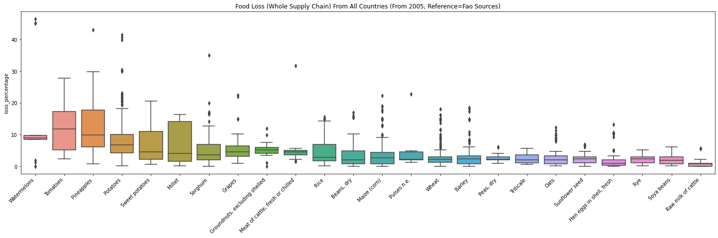
- By looking at the plot, it seems like fruits (e.g., tomatoes, watermelons) produce more waste than grains (e.g., oats, rye)
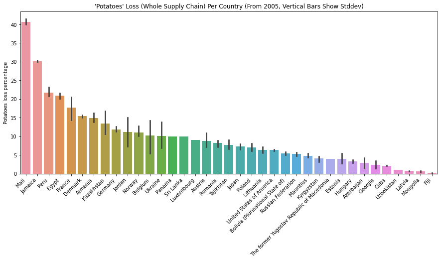
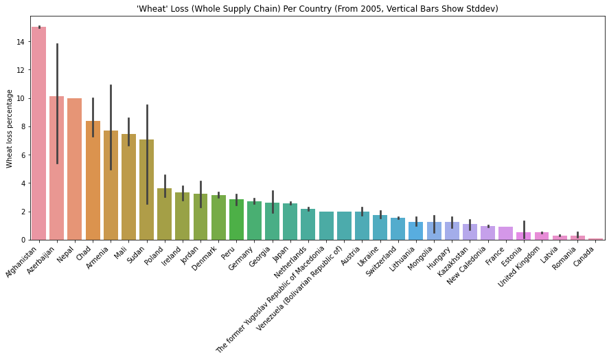
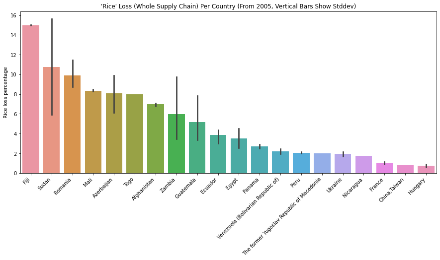
Which Country Has the Highest Food Loss?
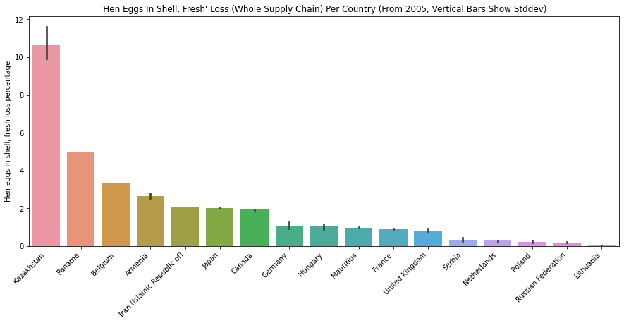
The below plots show how much food loss percentage for “Potatoes”, “Wheat”, “Rice” and “Hen eggs in shell, fresh” for different countries. We can interpret how efficient/inefficient each country’s supply chain is for various commodities.
supply_stage = "Whole supply chain"
year = 2005
reference = "FAO Sources"
data_collection_method = "FAO's annual Agriculture Production Questionnaires"
df_filtered = df[(df['food_supply_stage'] == supply_stage) &
                 (df['year'] >= year) &
                 (df['reference'] == reference) &
                 (df['method_data_collection'] == data_collection_method)]
unique_country_commodity_pairs = set(zip(df_filtered['country'], df_filtered['commodity'])) # unique (country, commodity) pairs
common_commodities = [commodity for commodity, _ in Counter([commodity for _, commodity in unique_country_commodity_pairs]).most_common(10)]

commodity_to_plot = ['Potatoes',
                     'Wheat',
                     'Rice',
                     'Hen eggs in shell, fresh']
for commodity in common_commodities:
    if commodity not in commodity_to_plot:
        continue
    df_filtered_by_commodity = df_filtered[df_filtered['commodity'] == commodity]
    fig, ax = plt.subplots(figsize=(15, 6))
    plot_order = df_filtered_by_commodity.groupby(by='country').mean().sort_values(by='loss_percentage', ascending=False).index.tolist()
    sns.barplot(x='country', y='loss_percentage', data=df_filtered_by_commodity, ax=ax, order=plot_order)
    ax.set_xticklabels(ax.get_xticklabels(), rotation = 45, horizontalalignment='right')
    ax.set_title(f"'{commodity}' Loss ({supply_stage}) per Country (from {year}, Vertical bars show stddev)".title() )
    ax.set(xlabel=None)
    ax.set_ylabel(f"{commodity} loss percentage")
    plt.show()
Limitation of the Dataset
If you look at the Background of the Food Loss and Waste Database page, FAO describes the limitations of the dataset.
- Often studies will sum the loss percentages across the supply chain. This tends to inflate the overall percentage losses and negate that the quantities of the commodities decrease through the supply chain with respect to losses and other utilizations.
- The issue of food loss may not be fully captured within national estimates as they often present the lower bound of the problem. On the other hand, studies done with small sample sizes may not be fully representative, even though they represent the upper bound of the problem.
- The figures show differences between estimates along different stages of the value chains and regions, making a one-size fits all estimate at the international level less practical when addressing losses. Considering how these estimates change over time by stage and ranges, it will be more effective to look at supply stages which fluctuate in their losses in order to focus on effective policy and investments.
- Effective comparison of data is presently hindered by a lack of comparability on many levels: different measurement methodologies across space and commodities, and estimates that may not be repeated over time.
- There may be underlying biases when it comes to the data that has been collected, both at the national level and within the individual studies and the focus will be put on problematic areas
- In the case studies, the sample sizes may not be large enough to extrapolate causes and solutions to a general policy prescription.
IMO, this means we can’t draw any conclusions from the data. I appreciate and highly think of the initial effort to collect the data. Still, I look forward to more standardized data collection so people can do more insightful analyses.
Comments
M
Very interesting
Leave a comment
Your email address will not be published. Required fields are marked *