Satellite Image Analysis - NDVI Change Over Time
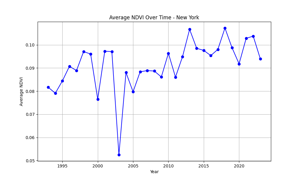
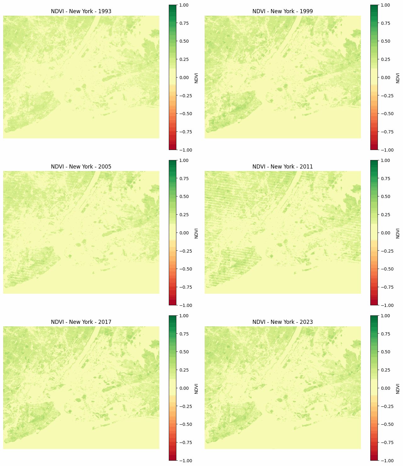
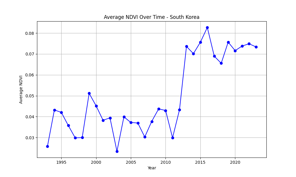
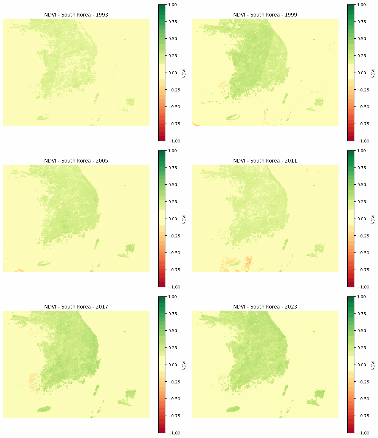
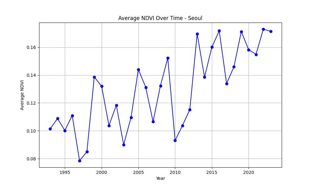
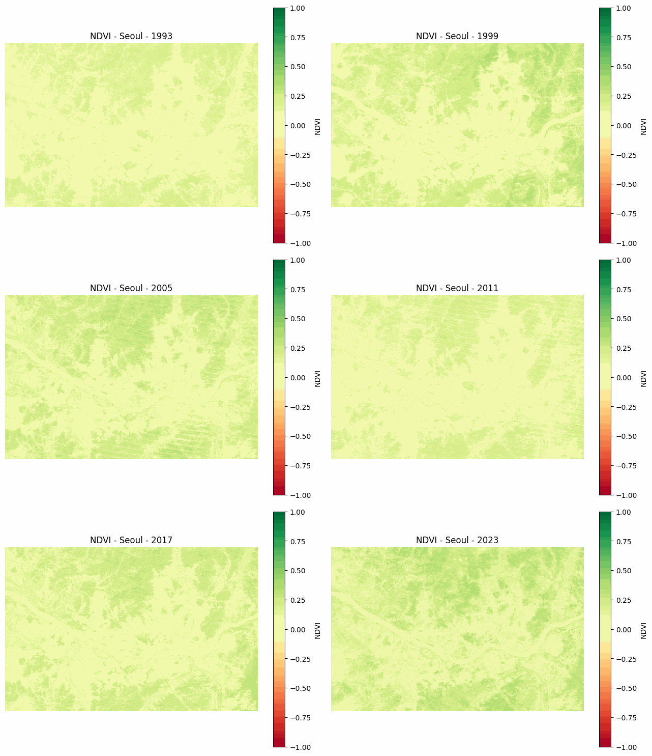
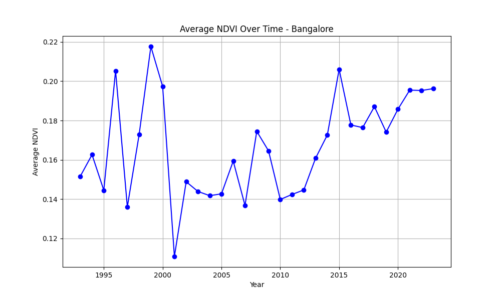
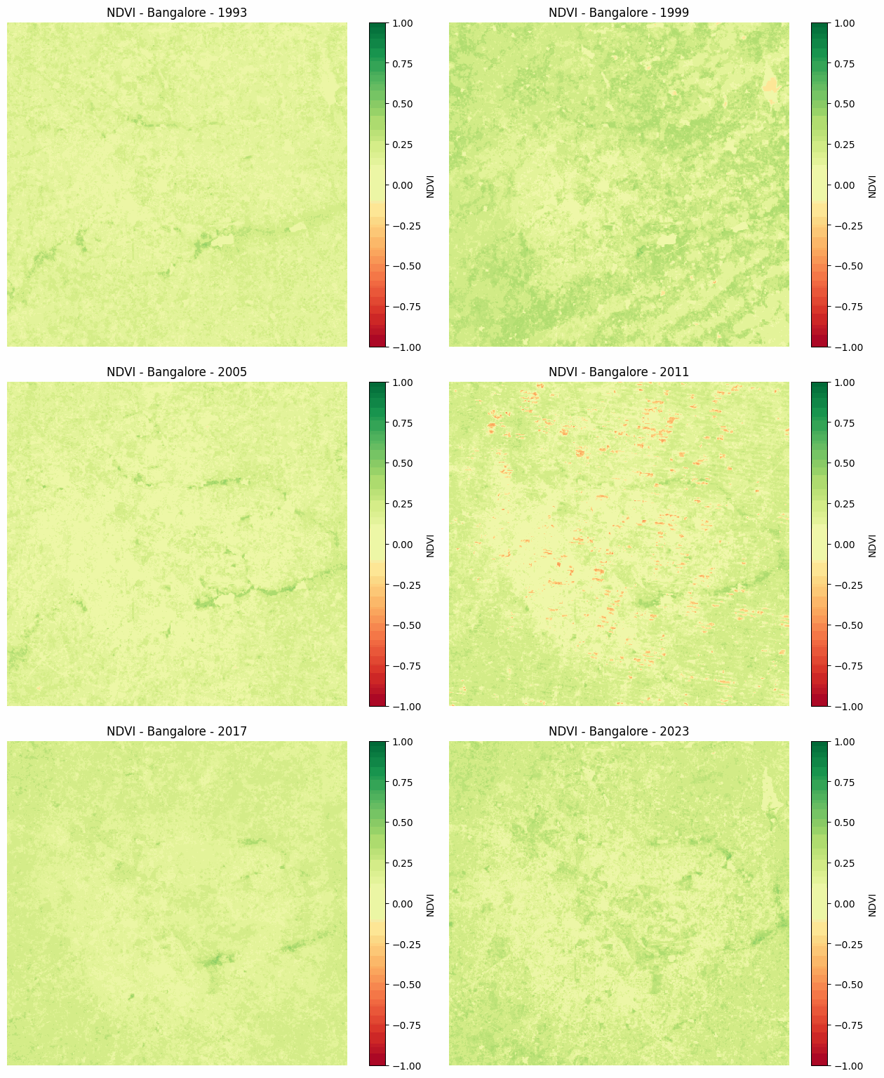
I’ve always wanted to dive into satellite image analysis. It’s one of the first things that comes to mind when I think about the intersection of sustainability and computer vision. This week, I spent some time setting up Google Earth Engine and experimenting with its APIs. I wrote a script to visualize how the Normalized Difference Vegetation Index (NDVI) changes over time.
This project was more about getting familiar with the tools rather than performing a detailed analysis. If you’re curious about how I implemented everything, check out my repo! And if you’re interested in exploring satellite analysis during your free time, feel free to reach out.
Quick Learnings and Disclaimers
Before jumping into the plots, here are a few things to keep in mind:
- The data here is for practice, not analysis.
- My code hasn’t been tested, so there could be bugs or logical errors.
- While I understand the NDVI formula, I don’t fully grasp what specific values (e.g., NDVI = 0.2) represent in real-world terms.
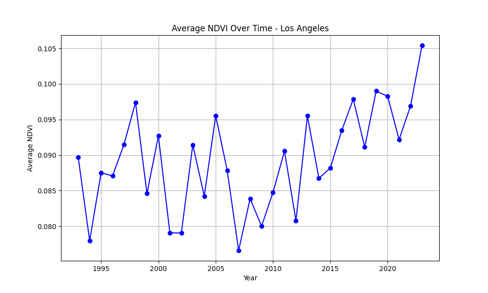
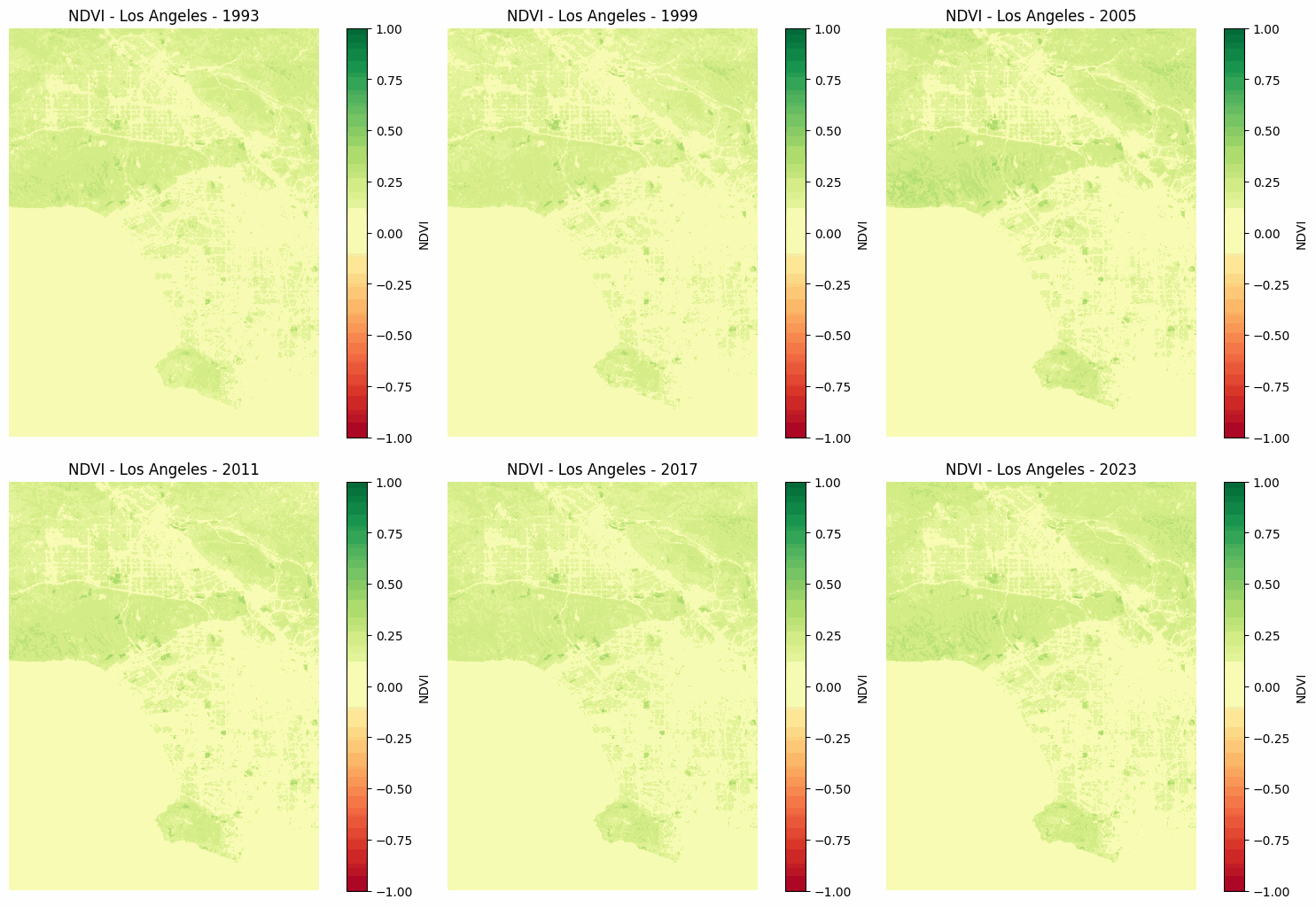
- The regions of interest (ROI) I selected aren’t entirely accurate. For instance, some areas include large portions of the ocean, while others don’t, making direct comparisons unreliable. For example, if City A has an average NDVI of 0.2 and City B has 0.7, we can’t say City B is “greener.”
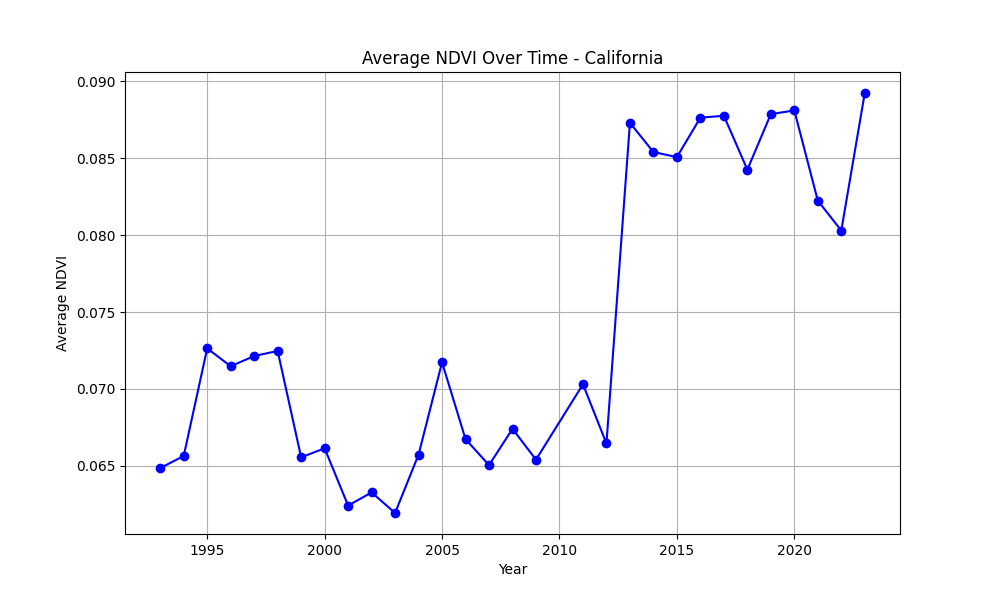
- Sudden NDVI changes (2012–2013): Some places show abrupt shifts in NDVI values during this period. This is likely due to a mistake in my
get_landsat_collectionfunction.
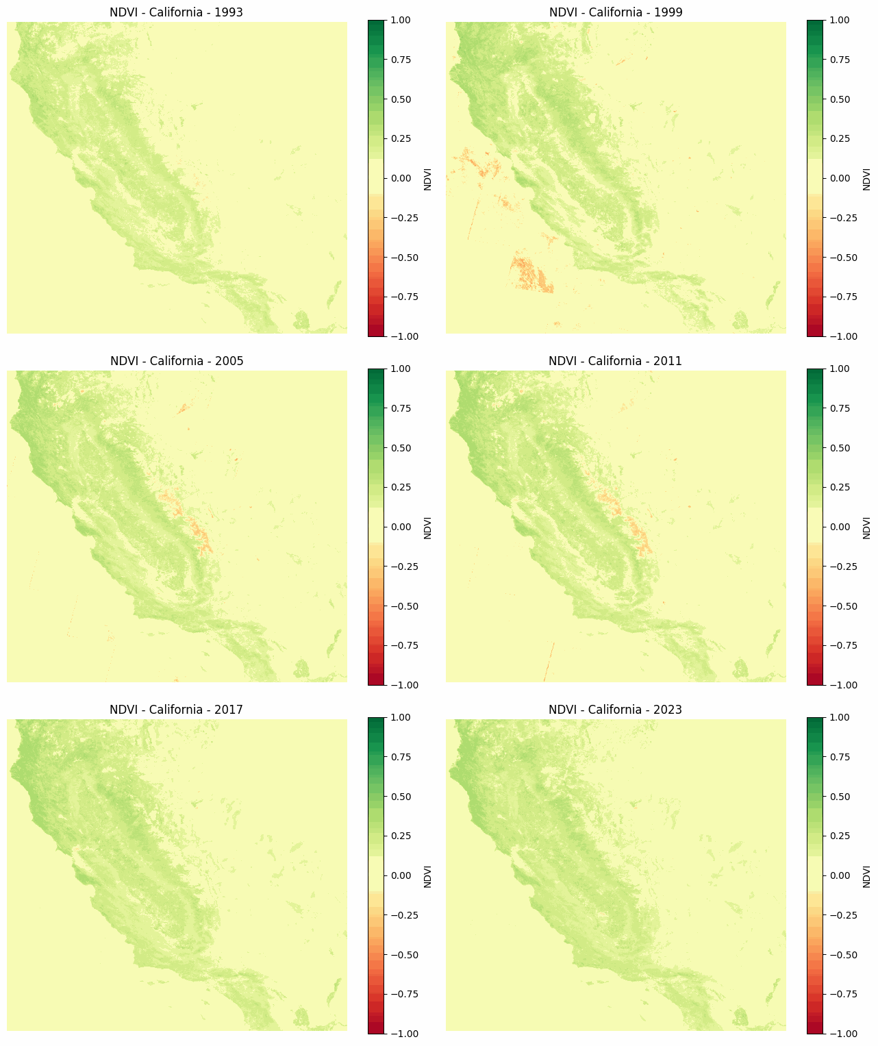
California
Los Angeles
New York
South Korea
Seoul
Bangalore


Leave a comment
Your email address will not be published. Required fields are marked *